Responsive Web Design and Progressive Web App (PWA): The Differences

With these two being so similar in the way they look and perform, you must wonder why there isn’t a more detailed comparison between the two popular approaches to web development: responsive web design and Progressive Web App. Well, this is it. In this article, we will compare responsive web design with Progressive Web App, and find out just where do they really differ from each other.
Responsive Web Design
What it is
Responsive web design (RWD) is an approach to web development first described by Ethan Marcotte back in 2010—five years earlier than the conception of Progressive Web App.
How it works
Basically, the philosophy of responsive web design is that design and development should be made with the goal of responding to the user’s device—which means responding to the behavior, size, platform, and orientation of the device in use. This is achieved with the use of fluid grids, flexible images, and CSS media queries:
Fluid grids, flexible images, and media queries are the three technical ingredients for responsive web design…
Ethan Marcotte, Responsive Web Design
Fluid Grids
Responsive websites designed with fluid grids can better handle the varying screen sizes on the market since, instead of defining pixel-based dimensions, fluid grid adopts a new percentage-based calculation.
Flexible Images
Images on the Web are not naturally fluid, but with some configurations (width property set to 100%, and the height property set to auto), any image can be made to be responsive across all devices.
CSS Media Queries
While a responsive web page with flexible images and fluid grids is technically responsive, it doesn’t look as good as it can be. This is where CSS media queries come into play as these are used to create an even better experience, tailored for different devices. These tailored experiences are often introduced by the use of adding breakpoints that take effect at specific screen sizes.

viewport meta tag makes the page responsiveSource: w3schools.com
On the whole, responsive web design has made today’s Web so much more accessible, since the approach eliminates the needs for more development phases which were previously required to accommodate the varying screen sizes on the market. Or, in its creator’s words, this approach to web development finally allows us to “design for the ebb and flow of things”.
Examples
Responsive websites are a commonplace nowadays, and almost every website that you come across is somewhat responsive in its nature.

[Source: Powerful Examples of Responsive web Design]
Progressive Web Apps
What it is
First coined by Alex Russel back in 2015, Progressive Web App is the next natural evolution of the Web due to its many benefits over the typical responsive website. The “progressive” part, according to Pete LePage – Google Developer Advocate, can be explained as “as the user progressively builds a relationship with the app over time, it becomes more and more powerful”.
To put it in layman’s terms, a PWA is your app-like website with (almost) all the features you can expect from a native mobile application, including push notifications, offline capabilities, and so on. And because of this, the whole experience is a step up from its responsive website counterpart since PWA can retain all the supposed benefits that come with a web-based platform.
Related article: What is a Progressive Web Application?
How it works
It’s actually pretty easy to sum up the core components of a PWA. Basically, in order to make all the aforementioned progressive features possible, these are the requirements:
Web app manifest
The web app manifest is a JSON file that provides the necessary metadata for the installation process of your PWA and determines how your PWA presents itself on the user’s home screen.
Service workers
Universally regarded as the foundational component that makes all the progressive features of PWA possible, service workers runs independent of the browser and on a different thread to the main JavaScript.
Secure contexts
As a new standard of the Web, it’s required that a PWA must be severed over a secure protocol—HTTPS. This guarantees secure communication between both the user and the server and in return, ensuring a risk-free experience.
Examples
As PWAs behave no differently than native mobile applications, you might have visited a PWA site before without knowing it. Think of big, app-like sites like Instagram and Pinterest—they’re all powered by PWA.

Recommended reading: 40+ Best Examples of Progressive Web Apps
Where they overlap
A similar experience with modern features
If everything is making sense for you thus far, then you should see that responsive web design (RWD) and PWA overlap a lot when it comes to user experience. Technically, PWA is responsive—as in the approach is made to be suitable for viewing on all devices, with a bit of modern touch to enable more app-like features.
And since they’re both approaches to web development, they share almost all the same benefits from the Web which include:
- One URL, one codebase for all platforms
- Enhanced security with HTTPS
- Better discoverability and always up-to-date
Where they differ
This is where things get interesting, as these two approaches to web development—while mostly similar in appearance—differ a lot in their real-world impacts.
In terms of features
A PWA, by definition, comes more features-packed than your typical responsive website. By taking advantage of recent advances in web technologies, i.e. service workers and web app manifest, PWA can deliver features that were previously exclusive to native mobile apps such as:
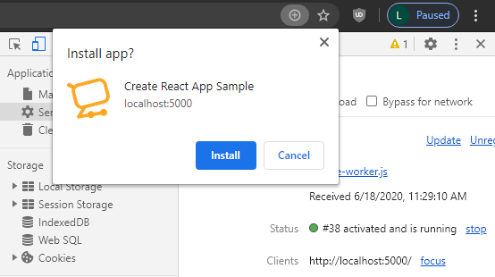
Add to Home screen
With registered service workers and a web app manifest, PWA is installable on every device that has a supporting browser.
>> Learn more: Create Your First PWA
Push Notifications
Through service workers, you can send notifications and have them displayed on the user’ devices just like how a native application would. This is a relatively recent feature of the Web which takes advantage of Push API, Notifications API, and Web Push Protocol; and in the near future, this feature is only getting better thanks to the advent of Notifications Triggers and Badging API.
Offline Capabilities
Thanks to the help of the in-browser, programmable network proxy namely service workers, PWA can proactively cache and serve offline content without having to rely on outdated caching mechanisms such as HTTP cache.
Notes: Responsive websites can still benefit from all the existing APIs from the web to deliver optimal user experience as well—it’s just that you won’t get all the features reliant on service workers.
Recommended reading: Progressive Web App (PWA) and Hardware Access
In terms of performance
Since responsive websites are still your typical website held back by all the drawbacks associated with the current HTTP caching mechanism, it’s reasonable to expect better performance out of PWA as it uses a newer, more performance-oriented caching mechanism called service workers.
Faster caching mechanism
With service workers registered, you can have control over exactly what is being cached, and drive better experiences for returning visitors as a result of which.
The real-world performance impact of service workers isn’t something that hasn’t been carefully observed either. By using time to first paint as a metric to measure the user’s first experience with a website, Google themselves has conducted a study observing the performance of Google I/O web app with a controlled group (where a service worker controls the web app) and a supported group (where service workes is supported by the browser in use but it’s not yet controlling the web app).

firstpaint time. [Source: Philip Walton]The results were particularly impressive on desktop, as here we can see service workers did its part to reduce the original firstpaint time (912ms) to a mere 583ms. This is as close to an instantaneous experience as it gets.
Things are, however, a little less impressive on mobile devices:

firstpaint time on mobile [Source: Philip Walton]Here we can see that the tail end of the controlled group does still look a bit similar to the supported group. This is largely due to the fact that on mobile, service worker threads aren’t as optimized and need more time to start as compared to desktop.
Overall, the performance increase achieved with service workers—or in other words, with PWA—is nothing short of phenomenal. There is, of course, still some work to be done on the mobile service workers’ end; but we feel that on the whole, it’s still a marginal step up to what the Web once was, and a step in the right direction at that.
In terms of security
HTTPS—The line dividing
While a typical responsive website can be just as secured as a PWA, it’s not required of responsive websites to use secure communication protocols. This is the opposite case with PWA-powered websites as Google, founder of PWA, requires that all communications between the server and the client in a PWA are to be encrypted through the use of HTTPS.
Most of the features related to a PWA such as geolocation and even service workers are available only once the app has been loaded using HTTPS.
MDN web docs, Progressive web apps (PWAs)
Conclusion
The abovementioned performance uplift achieved with service workers, combined with additional app-like features such as push notifications, add to home screen (and in the near future, geofencing and periodic sync), all prove to make PWA the suitable candidate for being the next evolution of the Web. As of now, the PWA movement is already widely encouraged by almost all of the big guys, including Microsoft with their push of PWA adoptions in Windows 10. It won’t be long now before we see a future full of Progressive Web Apps—like the one Steve Jobs envisioned:
The full Safari engine is inside of iPhone. And so, you can write amazing Web 2.0 and Ajax apps that look exactly and behave exactly like apps on the iPhone. And these apps can integrate perfectly with iPhone services. They can make a call, they can send an email, they can look up a location on Google Maps.
Steve Jobs, 2007