Top UI Considerations for the Best PWA Design

If you have not heard about PWA yet, you should dive into this one first: “What Is PWA? All You Need to Know About Progressive Web Apps”. In short, they are web applications made with the intention to offer user interfaces and experiences that are far superior to the experiences offered by traditional ones.
In this article, we will suggest the top UI (User Interface) concerns when designing a PWA. Read on to find out how you can have the best user interface for your Progressive Web Application.
System Fonts
If you want users to feel comfortable while using your Progressive Web App (PWA), its style should be improved a little to match their Operating System (OS). Before implementing different menus and buttons per platform, you can just start with the system’s preferred font, for iOS, Android, Windows separately.
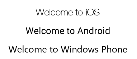
In other words, let the hard work of Microsoft (Segoe), Google (Roboto), Apple (San Francisco) or even Mozilla (Fira Sans) make your job easier by enhancing the experience for the users. As a result, system fonts are one item that you should never leave off your list.
/* iOS */
font-family: 'Helvetica Neue', Helvetica, Arial, sans-serif;

/* Android */
font-family: 'RobotoRegular', 'Droid Sans', sans-serif;

/* Windows Phone */
font-family: 'Segoe UI', Segoe, Tahoma, Geneva, sans-serif;
App Icons
It is true that mobile app designers pay special attention to icon design. And since your PWA (by adding it to the home screen) will sit next to the rest of the native apps, some thought should be given to its icon design too.
There is a good reason for this. First impressions are always extremely important, and an app’s icon is the very first impression it makes on the user. To explain, a user might hesitate to tap on an icon that has a different appearance amidst the native app icons on their phone.
To make your PWA icons blend in with the rest of the apps in your device, it must be flexible to fit within different platforms – such as Android, iOS and Windows– and accommodate stylistic elements (its shape, how it looks with/without backgrounds or in different colors, etc.). A good way to do this is to make the design of your PWA’s icon match– or at least come close to– the visual standard of native app icons. One source of inspiration is Google’s Material Design guidelines Google’s Material Icons.
Recommended reading: PWA vs Native App: Which Suits You Better?
Touch interactions
Touch interactions should be implemented very well, or not at all.
Although this is not really impossible, it is too difficult to incorporate advanced touch interactions, like “swipe to dismiss” or “pull to refresh”. While you think such interactions will wow users, this is only the case if they work as expected. If not then you are in trouble.
If your PWAs need advanced touch interactions, ensure that they work well on real devices. Usually, this signifies that you have found an implementation of this feature that has been developed by someone else with great effort, like brilliant react-swappable-views.
Meanwhile, you can entirely avoid this problem by modifying the design, this way it won’t suggest advanced touch interactions, for instance, you can use bottom navigation tabs in place of tabs.
Shareable content
In the case of Progressive Web Apps, often the current URL is not easily accessible; hence you must ensure that the users are able to share what they are looking at, easily. A share button can be integrated which allows the users to copy the URL to the clipboard so that it can be shared on prominent social networking sites.
A small tip for this case: If you’re implementing social sharing buttons, be sure to delay the loading of the 3rd party JavaScript until after the primary content in the page has loaded.
Touch feedback
Firstly, tappable areas should give touch feedback. When a button or tappable area is tapped, the user shouldn’t be left wondering if the tap was recognized.
Aim to make it immediately clear that the taps were recognized. For example, this can be done by highlighting the tapped region in (light) grey, showing a material ripple or having a page transition start immediately.
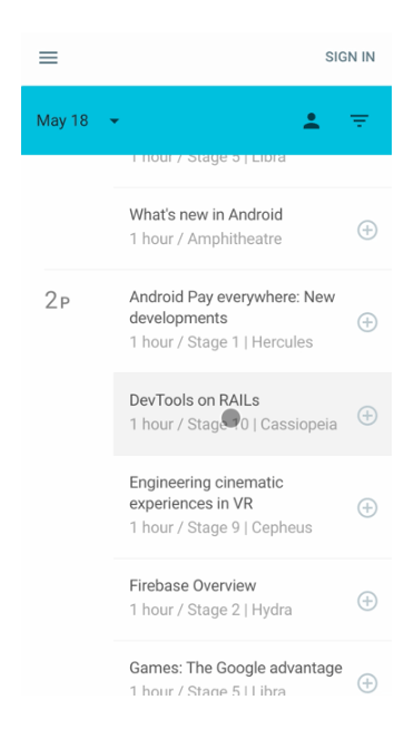
Example of touch feedback done well:
The Google I/O 2016 web app provides an immediate grey highlight when a talk is tapped and the default blue tap color is disabled (by default some browsers show their own highlight when elements are tapped. This default styling is unattractive and may conflict with your brand visual quality).
Secondly, touching an element while scrolling shouldn’t trigger touch feedback.
Whenever you implement the touch feedback, it is important that it doesn’t trigger mistakenly when the user is only touching an element to SCROLL the page.
Example of touch feedback given at the wrong time:
An early version of the popular Material-UI library triggered ripples on touchable elements when they were touched during scrolls.
The issue was fixed by aborting the ripple animation if the user’s touch location moved more than 6 pixels in any direction within the first few hundred milliseconds.
Retain scroll position on the previous list page
Pressing back from a detail page should retain scroll position on the previous list page
When the user presses back from a detail, page must retain scroll position on the previous list page. As a user picks items from a list and views its details, then tapping back must NOT bring them to the top of the list. The major aim is that while the user taps, he/she should be brought back to the list page “with the same scroll position” which they were at prior to pressing on the item.
After all, browsing a list of products, articles, or other items get difficult when pressing back brings the user to the top of the list again.
Obviously, when you make navigation more difficult for users, they tend not to come back again.
Avoid overly “web-like” design
“Classic” web design depends heavily on links in the text, and static elements available on every page such as a header and a footer. In fact, these design elements are rarely found in native apps, so in order to match user’s mental models, it is recommended to avoid these and use more app-like design instead.
For example, links should be used sparingly. You should place buttons or tappable regions carefully.
In addition, static page footers that contain navigation links and copyright information should be avoided. Take inspiration from native app design to see how similar information can be moved into a menu or otherwise not included on every page.
Dark theme
Dark themes are here to stay and they will only get better.
According to Android Developers, the dark theme has many benefits: Can reduce power usage by a significant amount (depending on the device’s screen technology). Improves visibility for users with low vision and those who are sensitive to bright light. Makes it easier for anyone to use a device in a low-light environment.
Those who can find the balance between the accessibility of dark UI and the emotive response of glaring colors will be on top next year. There is a guide from Google Material that can help you.
In conclusion
Progressive Web Apps are the need of the hour as they allow developers to deliver an intuitive web experience to the users on their phones. By simply implementing these recommendations, you can easily deliver your users great app-like interfaces and experiences while they use your PWA.